The fun side of CSS 🎲
A little fun 🎮
I started to learn CSS thanks to Grafikart's course on YouTube, and Flexbox' tools with Wes Bos' playlist. Regularly, I took little breaks at some point of the playlists and trained with 3 games I discovered this last week ! And believe me, you'll need some breaks throughout your learning process. Those games are a great mix between resting and training your skills. In some way, they materialize tools and functions that can sometimes leave us a very abstract feeling right after a course. Well, I let you discover those cute and tricky games !
CSS Diner 🍱
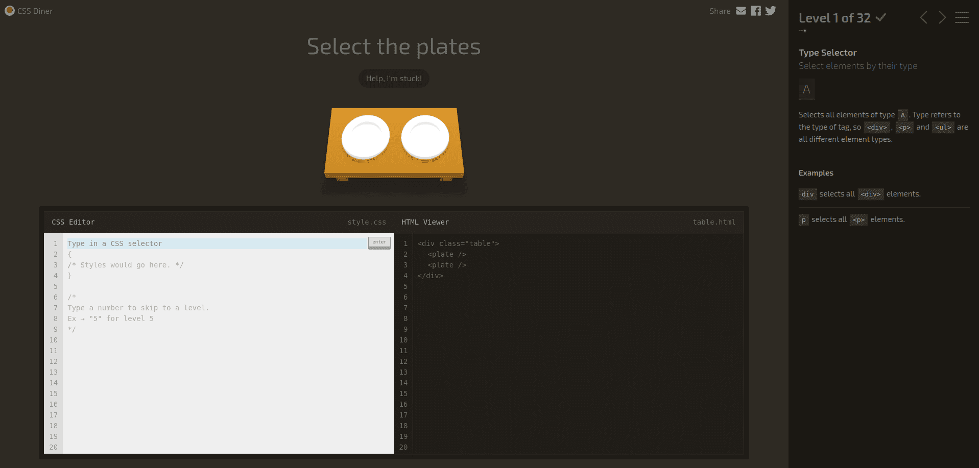
This game was the first I tried (and succeed !). It's about CSS selectors : their nature and how their rules interact with each other.
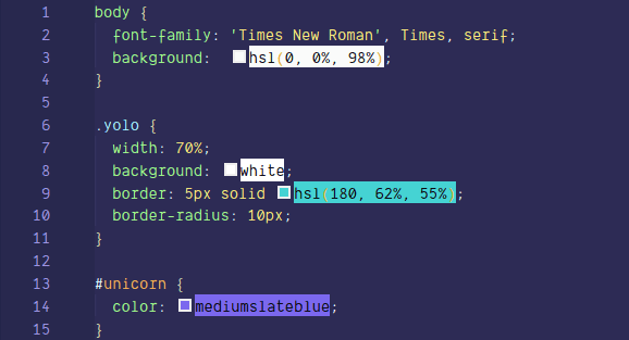
A CSS selector is the part of a CSS rule that describes what elements in a document the rule will match. The matching elements will have the rule's specified style applied to them. Your selector can be an single element, such as body. But it can also be a class, such as yolo : then all your elements with the class yolo will match the rule's specified style. You can also use an ID, like unicorn, then the style of all your unicorn elements will be set. But let's go back to our game. In CSS Diner, you'll explore selectors' possibilities for 32 levels by releasing cute and bouncing items such as plates, bentos and fruits. Go try it out ! 😄
Froggy Flexbox 🐸
Aaah, Flexbox. Such an awesome CSS module but also so confusing ! As the baby developer I am, I confess : I find this part of CSS as fantastic as frightening, haha. The Flex layout is an entire CSS module which contains its own bunch of properties. Metaphorically, that means Flexbox is like a little toolbox contained in a larger toolbox (CSS). It consists in a box model optimized for user interface design. This model allows you to organize the different parts and items of your website. More concretely, in this model, the children of a flex container can be laid out in any direction, and can “flex” their sizes, either growing to fill unused space or shrinking to avoid overflowing the parent. The elements' alignment is organized depending on the main axis (horizontal) and the cross axis (vertical). You can also manage the boxes' nesting to build layouts in two dimensions. In practice, it's a fantastic tool to use when you build the responsive part of a website. What is responsive ? Hehe, that will require an entire article if you want a clear and smooth explanation. Let's get back to business.
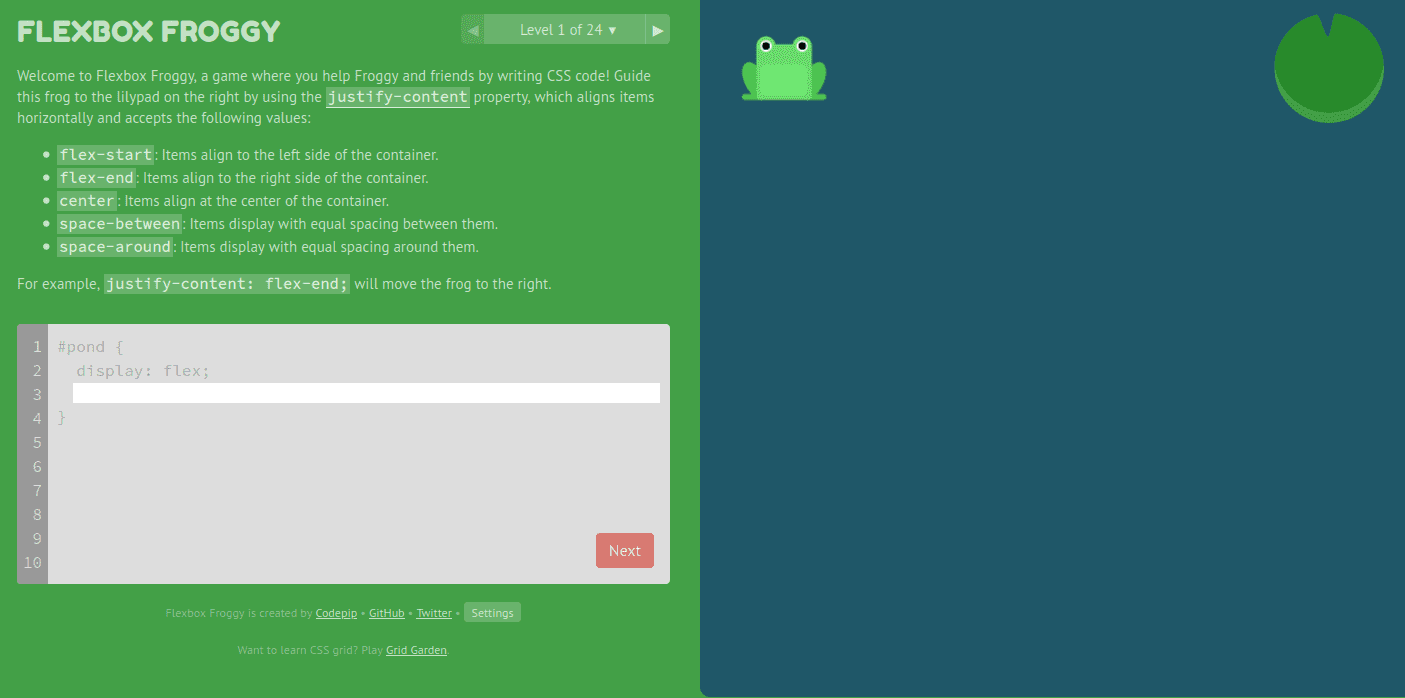
Once you've learned Flexbox' basics, you can try this game out. It's even cuter than CSS Diner : you'll help frogs to return to their lilypad and to the correct side of the pond, using Flexbox properties !
Flexbox Defense 🏰

This last game works the same way as the two others, but this time your goal is to protect your base by organizing your defense. You'll position your towers using CSS Flexbox to stop the incoming enemies. Like CSS Diner and Froggy Flexbox, the levels are getting harder as you progress in the game. Enjoy !
I let you discover these 3 games, feel free to share your enthusiasm ! 😉
References :