Responsive's notion
What is a "responsive design" ? 🖥
When you build a website, you want it to be reachable and functional on a desktop's screen, obviously, but also on a laptop, a tablet or a mobile phone. Congratulations, you've learnt the first part of what means "responsive" !
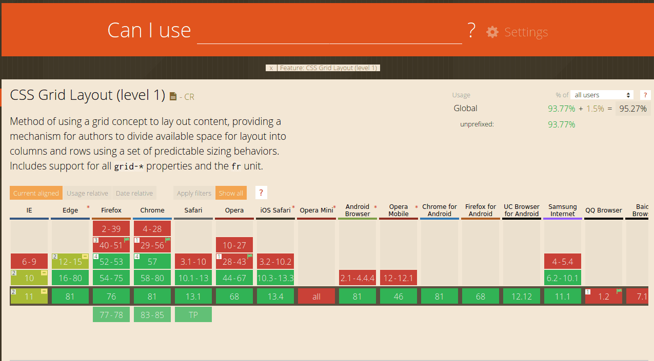
Nowadays different types of devices appear every day with tons of different screens, sizes and functionalities. When you build an app or a website, you can't make it work with pixel perfect (even if it can be satisfying), you must adapt and provide its functionalities for a maximum of machines. But responsiveness doesn't only depend on the device, it's also changing according to the browser you use. Not all browsers can support all the existent properties. It means you have to anticipate and manage your code to suit a lot of different situations. For example, if you're planning on using CSSgrid to organize your website's elements, make sure your client is not using an old browser or an uncommon one. To do so, go visit Can I Use, an ingenious website where you can check browser support tables for a lot of properties and formats.
How can I build a responsive website or web app ? ⚙️
Media query
Let's talk about media queries. Basically, it's a CSS rule which allows you to organize your site or your app depending on a device's type or more specific parameters. You can use the @media rule and choose the type you need : screen or print (good to know : you can use them together or separately). Then, you can specify the specific parameters of your targeted device, usually based on the screen resolution or the browser viewport width. The most commonly used parameters are max-width and min-width, which we configure with px unit.
Breakpoints & mobile-first approach 📱
These last parameters, max-width and min-width, are very useful to create what we call breakpoints. For example, when I start to style my HTML with CSS, I go mobile-first. Well, I hear you say "What ?! This is too much ! "Breakpoint", and then "mobile-first" ?!". Easy, easy, let's finish this example. Mobile-first concretely means that you firstly build the design for mobile devices, in other words for the smaller resolution your website or web app can handle. Then, based on your mobile design, you create media queries rules for larger resolutions. Why ? Quite simply because smaller device or resolution = lighter design. It's easier and it requires less lines of CSS to start with a simple design, and then modify it to make it more complex for a larger screen. To do so, I set up what we call a breakpoint : I choose a width from which I change the design to adapt it to a larger screen. It's written like this :
@media screen and (min-width: 1024px) {}Concretely, you can translate it as "Starting from 1024px, I'll apply the following style rules". So satisfying, huh ?
What does it looks like ? 👀
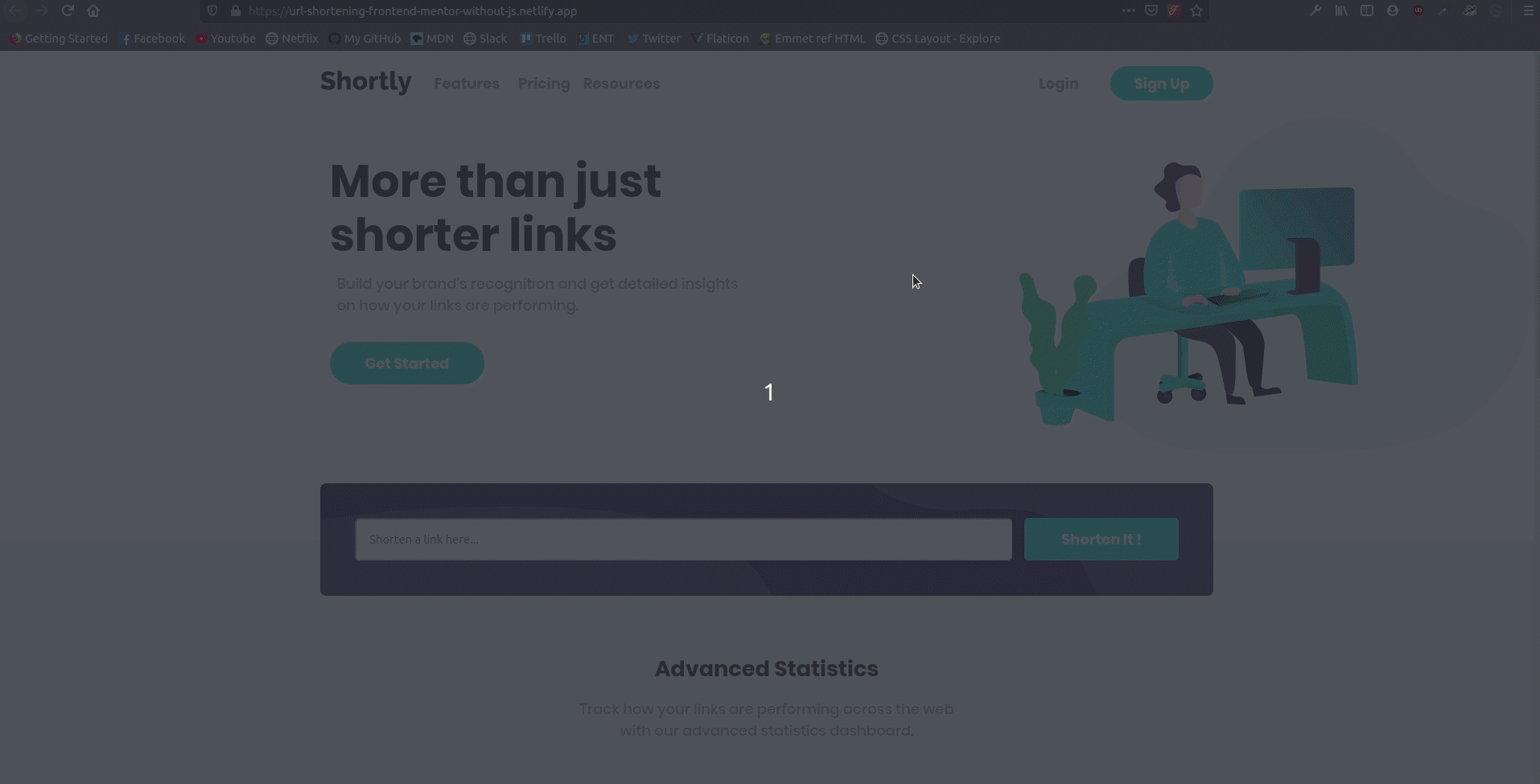
Now here are two gifs who show the screen size responsiveness. In the first, you can see a responsive website : when I reduce the screen size, the design adapts.
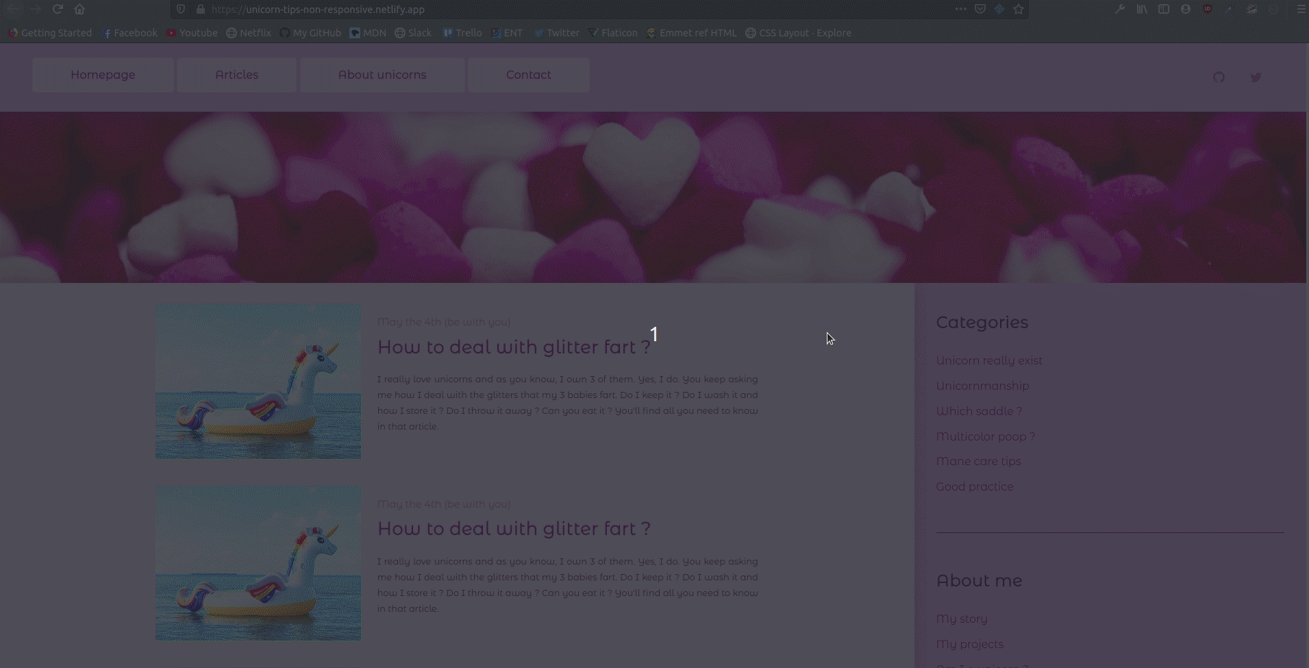
In the second gif, you can see a non responsive design : it simply doesn't adapt to different sizes and the design breaks.
And that's it ! Feel free to review this article and to send me some feedback. Bye ! 😄